What the old flow felt like
- 3-5 business days with weak expectation setting
- Unclear FX margins and late fee disclosure
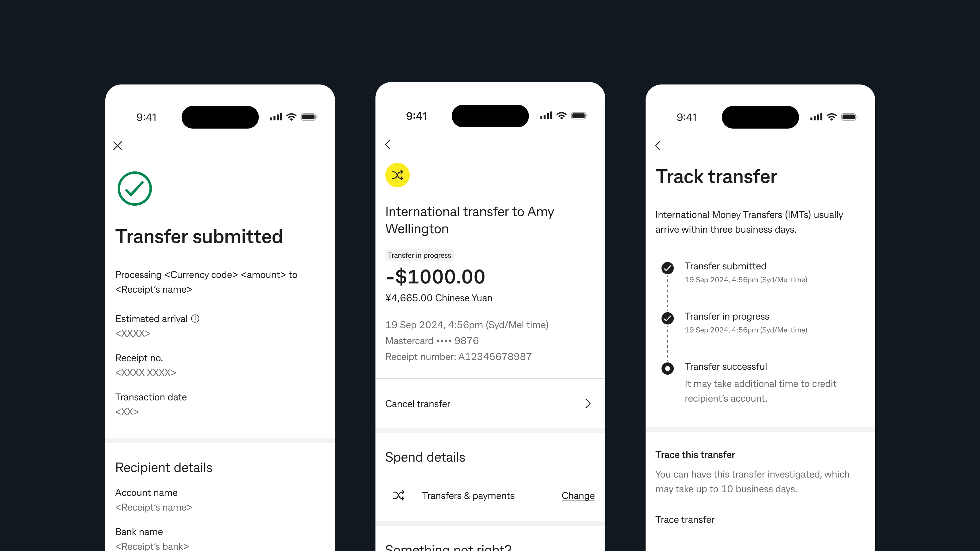
- Manual tracing instead of live status visibility
- Redirects to NetBank for selected currencies
Cross-border payments
Redesigning international transfers around trust, not rails.
Customers were choosing Wise and Remitly over their primary bank for international transfers, not because CommBank could not move money, but because competitors made the experience feel safer. I led product design across a new cross-border experience that made speed, status, and cost feel legible from the first screen through post-transfer tracking, aligning product, engineering, legal, and compliance around a journey customers could actually trust.
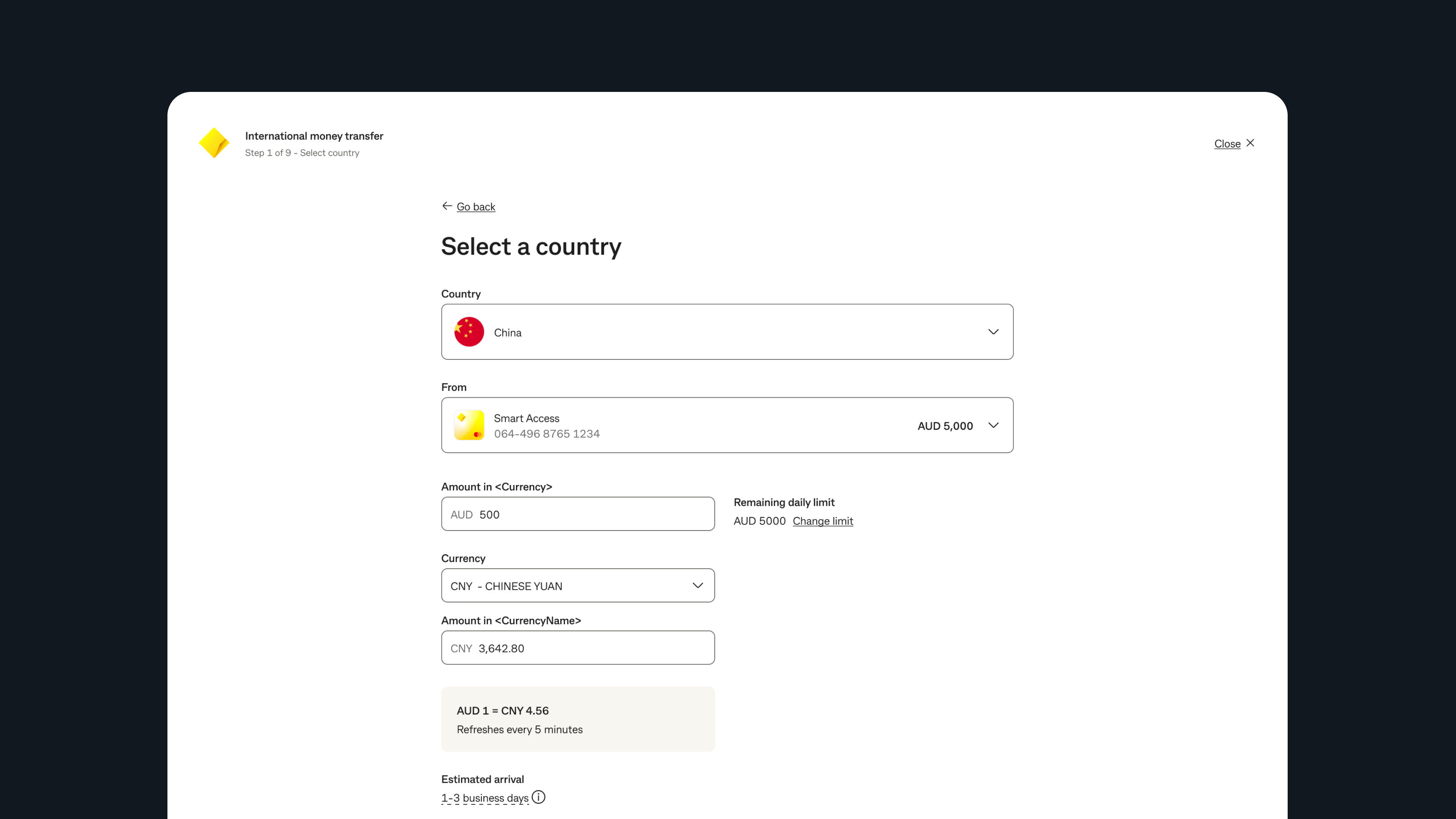
The redesigned flow made cost, timing, and corridor logic visible before commitment instead of hiding uncertainty until the end.
Challenge
CommBank's legacy international transfer experience asked customers to tolerate too many unknowns at once. They were redirected out of the app, fees were disclosed late, corridor requirements appeared mid-flow, and once the money left the account there was no meaningful in-app visibility into what happened next.
That combination produced something rare: a banking feature people actively avoided using with their primary bank, even though the bank already owned the relationship and the funds.
It just feels really clunky. I'm always convinced I'm going to stuff it up and my money's going to go off to some random stranger.
Insights
Research reframed the brief. Customers did not need a lesson in payment rails. They needed the experience to make the infrastructure feel legible. The anxiety in the journey came less from speed and more from incomplete information, broken momentum, and weak end-state reassurance.
The absence of status information was not neutral. It actively created anxiety.
Customers would tolerate waiting if timing and outcomes were explained clearly.
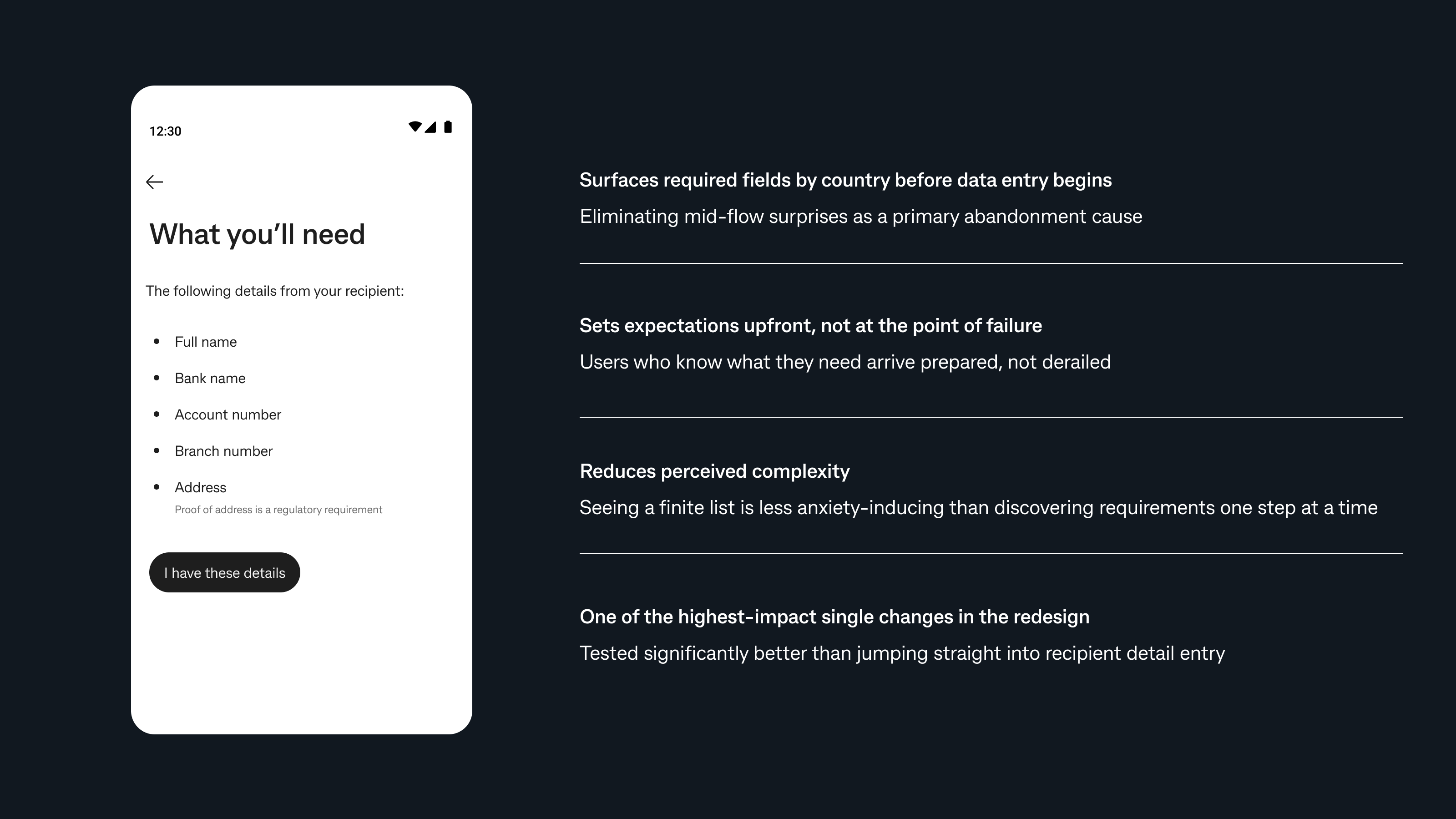
Surprise requirements mid-flow were one of the most avoidable causes of abandonment.
The experience needed one mental model even when the underlying rails differed.
Design
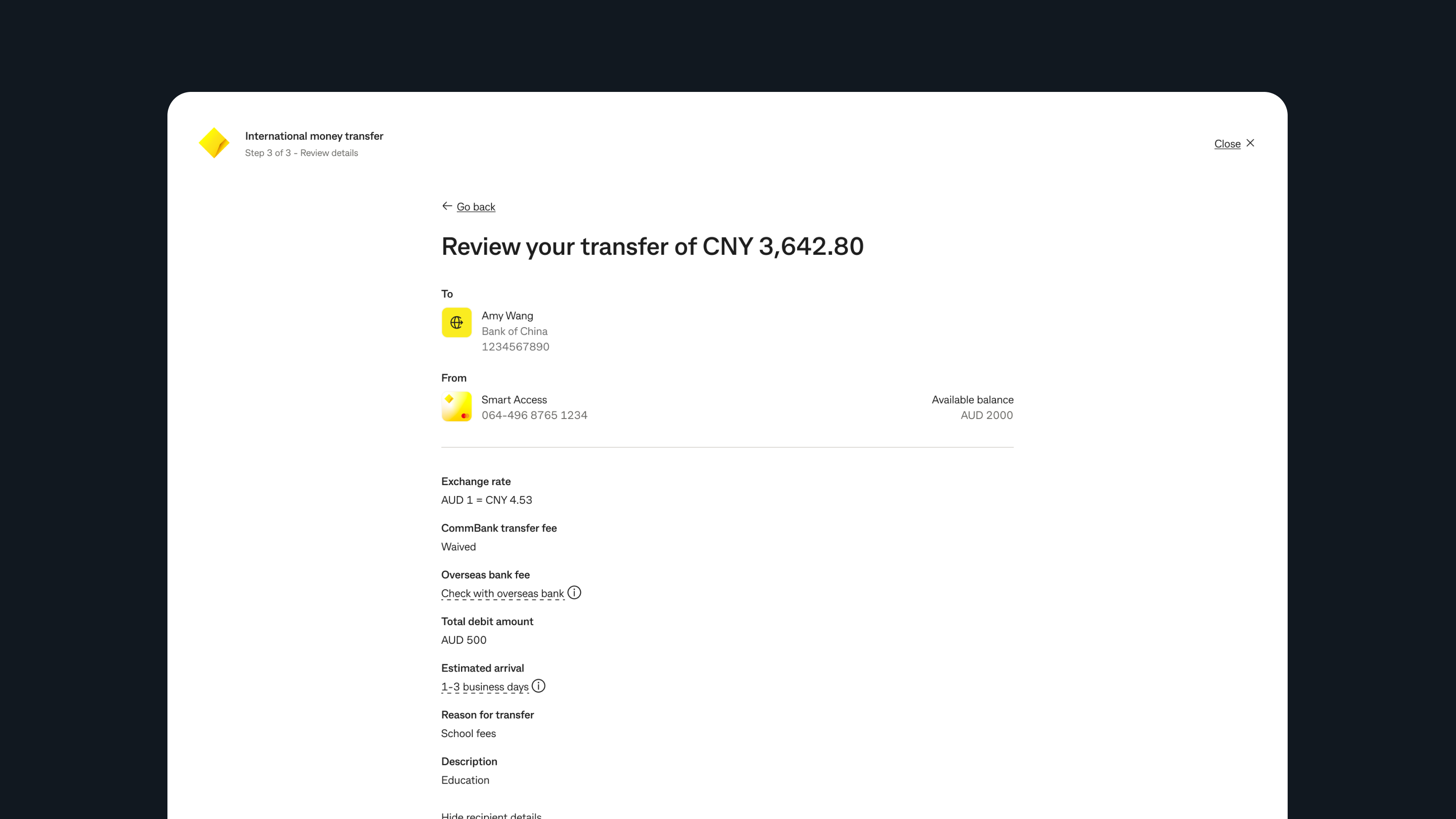
The most important moves were structural. I surfaced live FX and corridor expectations earlier, added a "what you'll need" preparation step before data entry, kept eligible journeys fully native inside the app, and gave end states the same design attention as the entry flow.

The core design principle was consistency of mental model: customers should not have to know whether they were on SWIFT or Dandelion. They should only feel that the experience was predictably CommBank.
Decisions
We resisted turning the experience into a pure speed story. Reassurance and clarity had a bigger effect on trust than aggressive claims about instant delivery.
Unknown overseas fees were surfaced clearly and earlier. Transparency built more trust than trying to hide imperfect information.
Different rails remained an internal concern. From the customer point of view, the experience was designed to feel seamless and familiar.
Outcomes
The strongest validation came from usability performance and the structure of the shipped phase 1 experience. The redesign translated new infrastructure into something customers could understand and act on with confidence.
Reflection
This project reinforced a lesson I keep returning to in fintech: infrastructure improvements do not automatically create experience improvements. Faster rails and better economics only matter when the design makes them understandable, trustworthy, and emotionally manageable.
What I would carry forward from this work is the importance of structural decisions. The best choices here were about timing, sequencing, wording, and end-state behavior. Those are the things that changed the emotional shape of the journey.
Next case study
How I turned a broker portal built on memory and workarounds into a clearer self-service platform.
Read the next case study