Heuristic findings
- Navigation mismatched broker mental models
- Inconsistent page structures and templates
- High cognitive load at key decision points
- Weak accessibility compliance
Enterprise B2B platform
Turning a portal people navigated by memory into a platform they could actually trust.
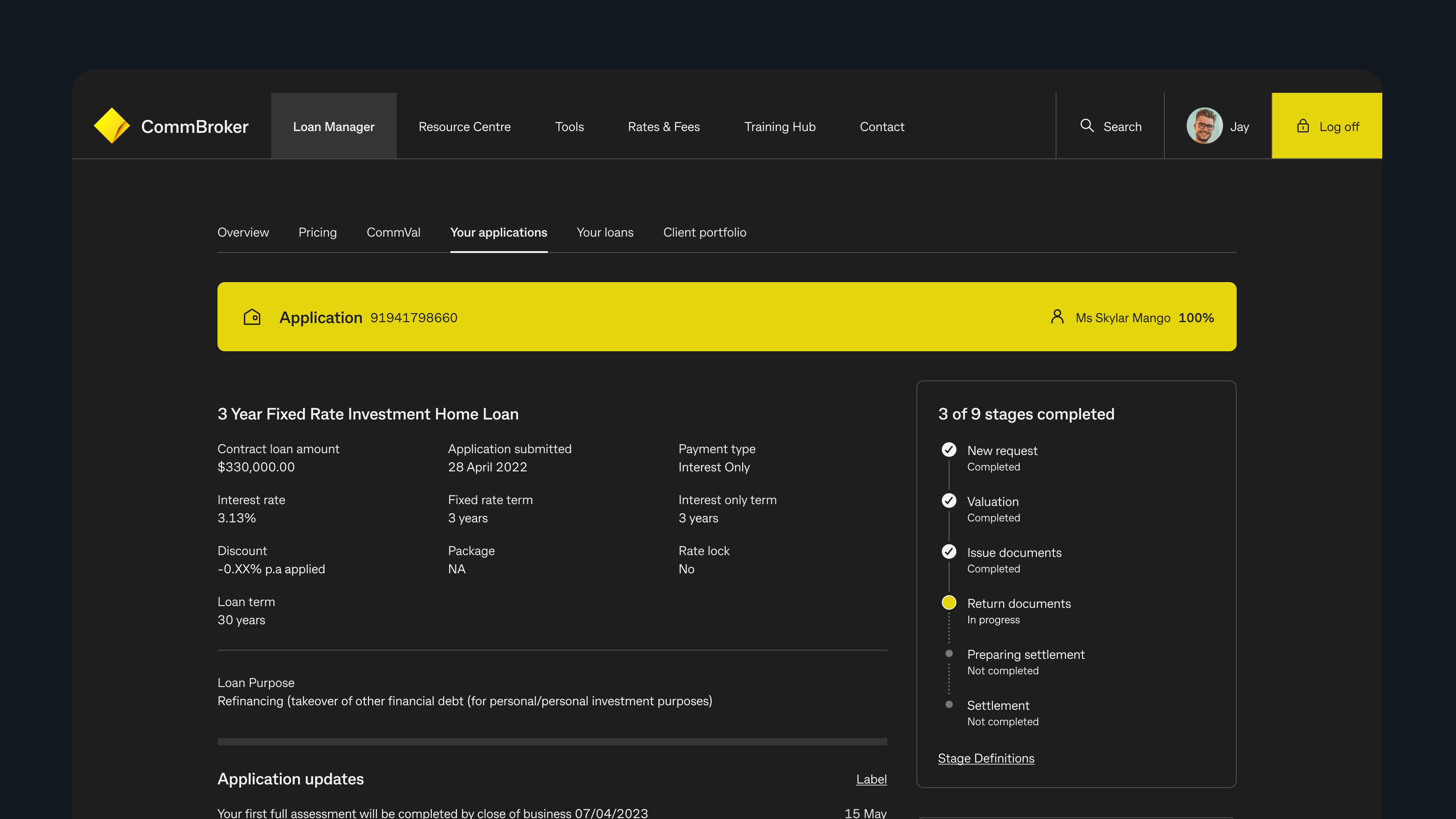
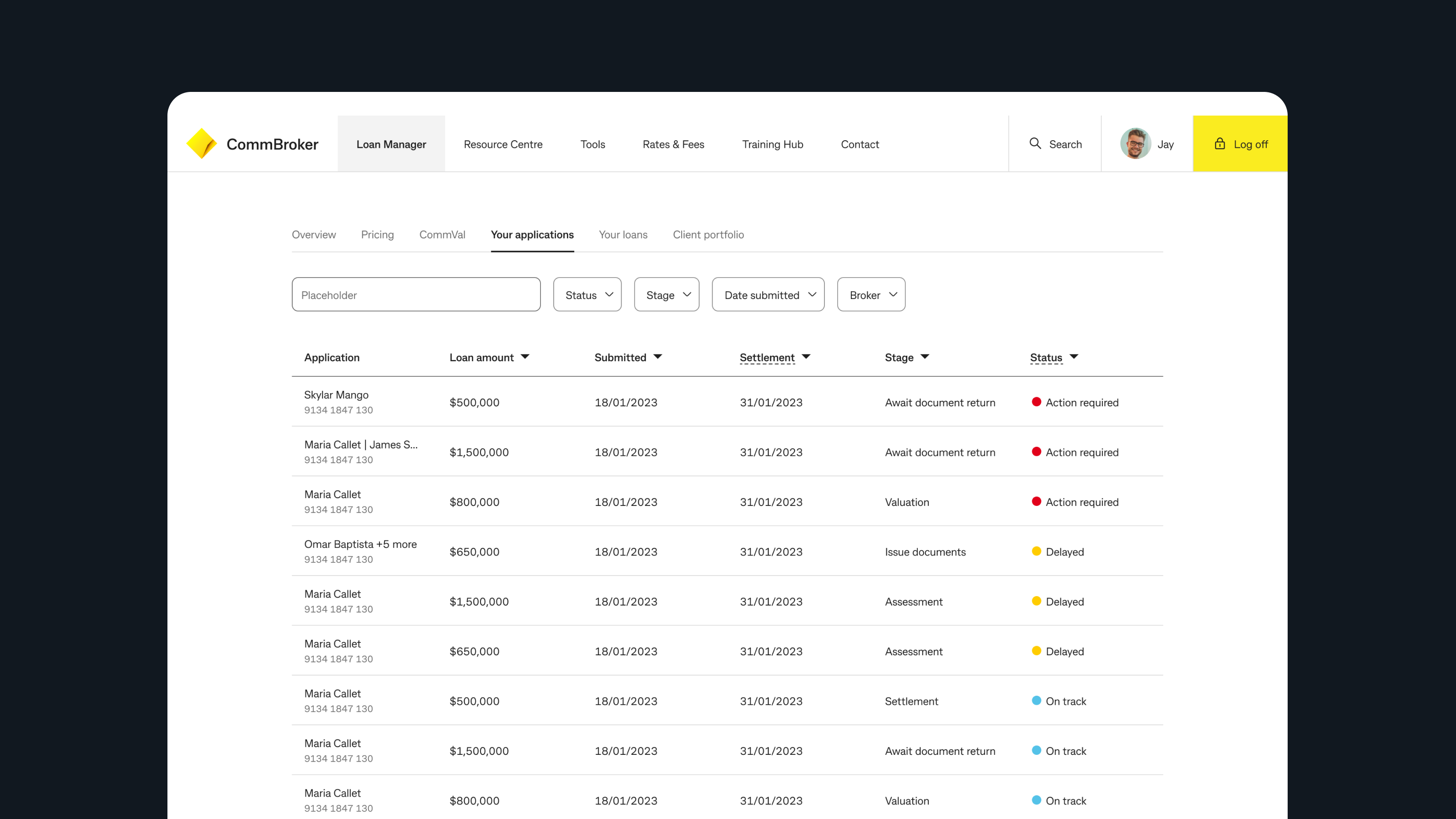
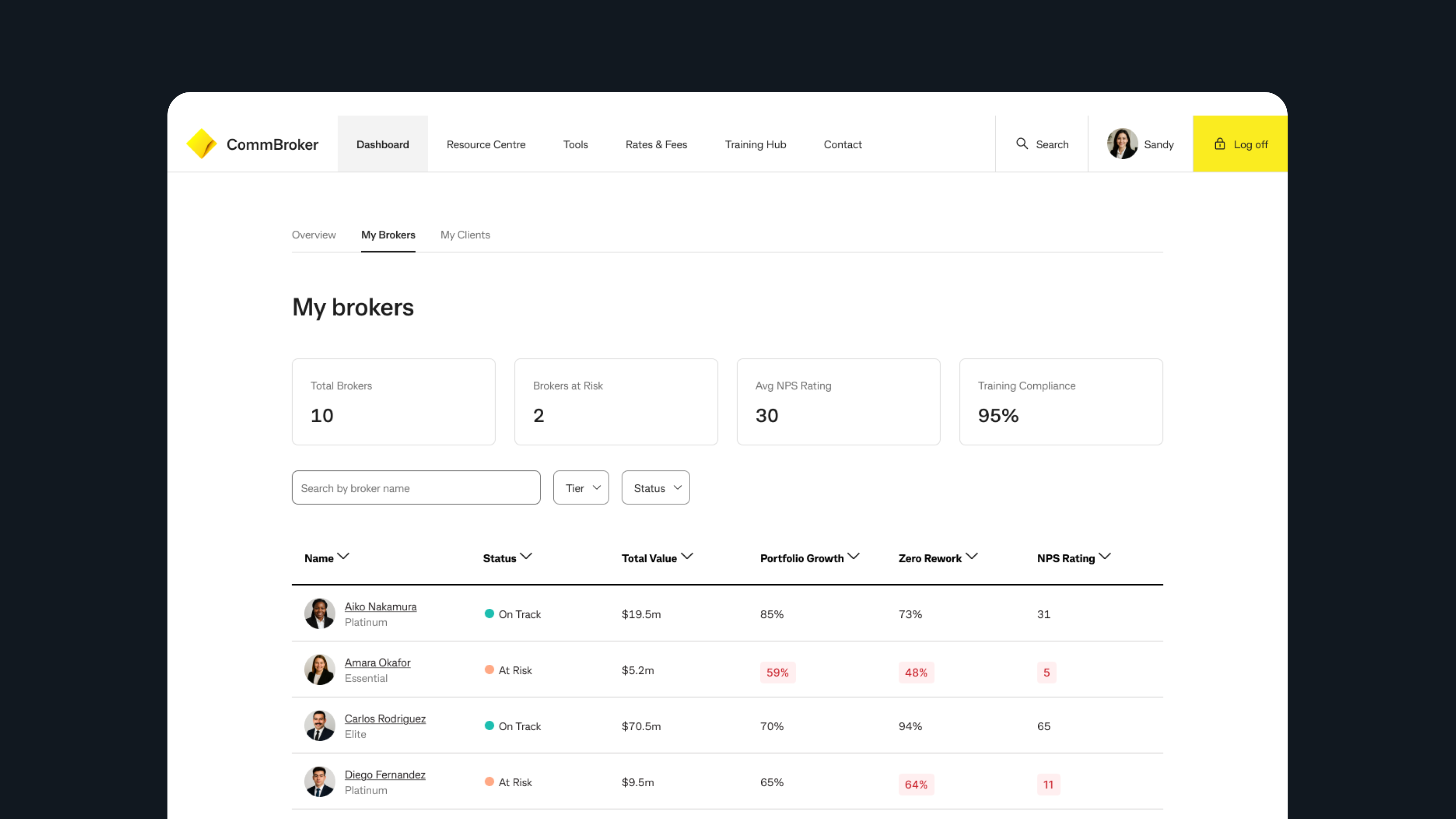
CommBroker is the primary digital platform for mortgage brokers to find policy, manage loans, and complete compliance-heavy work. The redesign challenge was not cosmetic. Brokers needed a clearer structure, faster access to answers, and a platform that could become the source of truth again. I led the redesign direction from IA research through concept selection, helping product and engineering reset the platform around broker tasks rather than internal ownership.
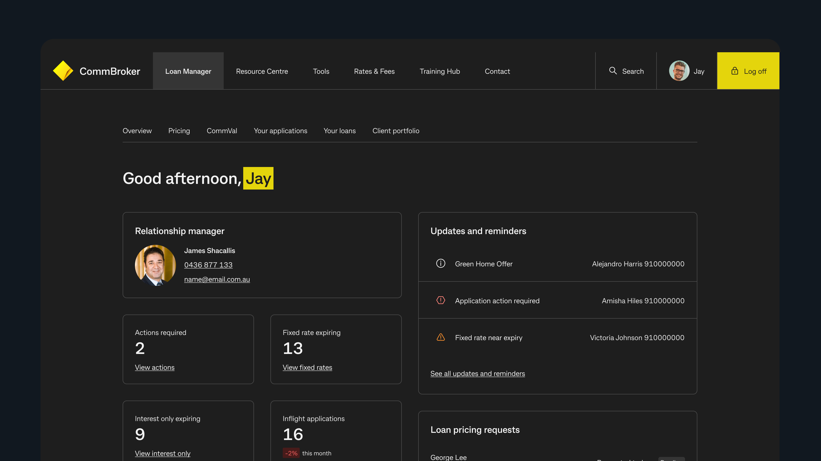
The redesign centered the product around what brokers were actually trying to do, not how CommBank was internally organised.
Challenge
Brokers used CommBroker to find policies, manage applications, and keep up with compliance-heavy processes. But the platform had become increasingly difficult to navigate. Content was duplicated. Information lived in the wrong places. The right answers often existed, but brokers could not reliably find them when they needed them.
In practice, the product had stopped behaving like the source of truth. Brokers were relying on personal workarounds and institutional knowledge instead.
Research
I grounded the redesign in a multi-layered research program: heuristic review, content audit, Treejack IA testing, moderated concept evaluation, and usability testing. The data consistently pointed to the same thing. Brokers were not confused by the policies themselves. They were frustrated by how much work it took to locate them.
Content audit across the platform to understand duplication, obsolescence, and structural sprawl.
Treejack IA testing to measure where the current structure failed before any redesign work began.
Concept testing with real brokers and assistants to compare familiar and divergent navigation models.
Moderated usability sessions to validate whether brokers could complete real tasks with confidence.
It feels like a guide-book.
Strategy
I developed two directions. One stayed closer to the existing structure. The other made a more decisive IA shift, consolidating fragmented destinations into clearer hubs. Testing revealed a sharp difference: the bolder structure delivered much higher discoverability and broker confidence, even if it asked users to learn a new model.
The critical tradeoff was accepting a short learning curve in exchange for a far more coherent system. Brokers told us the new structure felt more intuitive once they understood it, and the data supported making that bet.
Solution
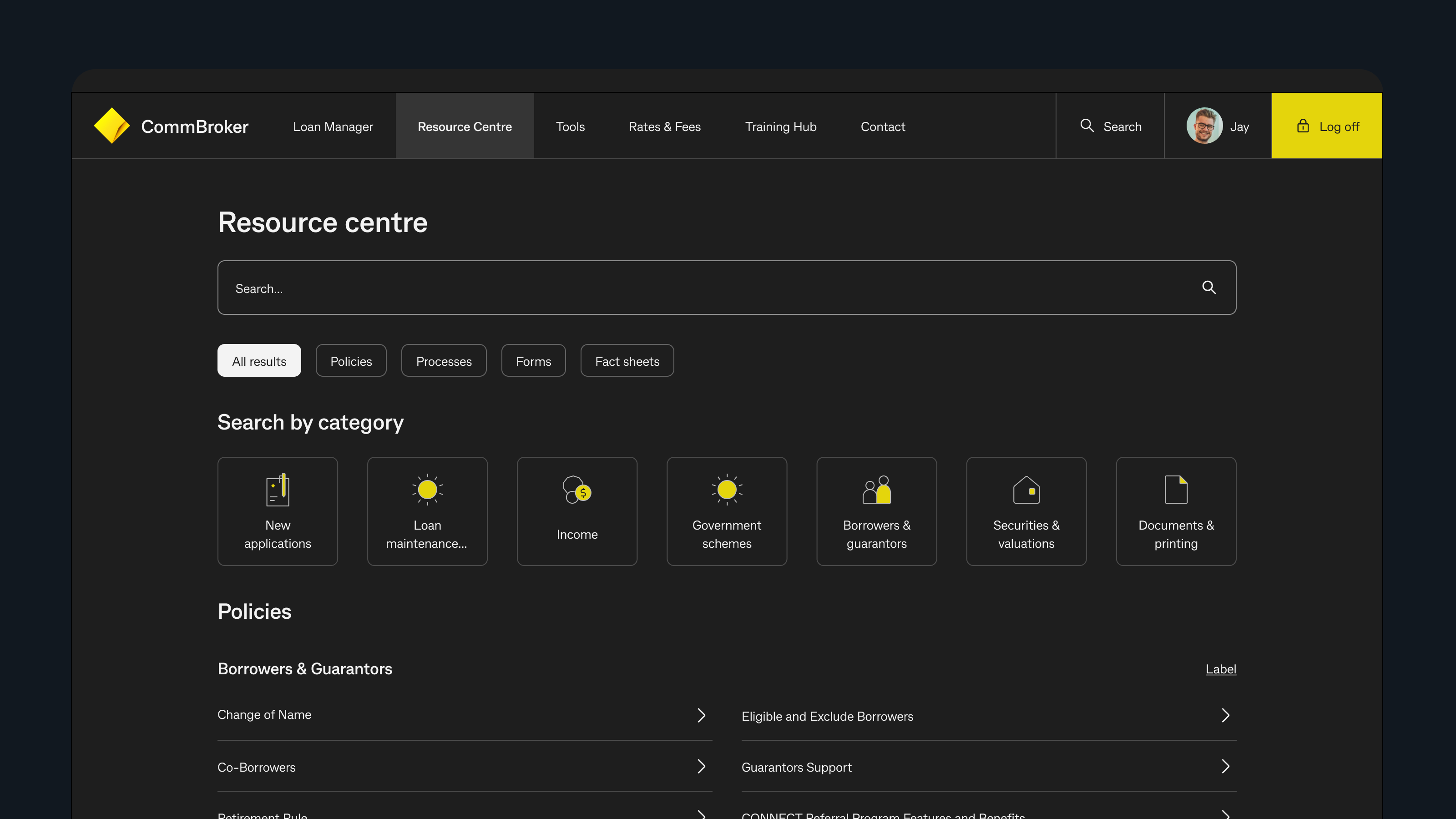
The final experience reorganised content around broker intent rather than internal ownership. I introduced a central Resource Centre as the primary entry point for policy, process, and forms, reduced navigation noise, and created more direct routes to applications, loans, and supporting tools.
Validate IA with real brokers before styling or detailing isolated pages.
Centralise fragmented knowledge into one dependable entry point.
Organise pathways around intent so brokers can find answers the way they think.
Outcomes
The headline number is 98 percent discoverability in concept testing, but the deeper outcome was a more reliable self-service experience. Brokers could find what they needed without escalating to support, relying on out-of-date bookmarks, or checking with peers to confirm policy details. That moved the platform closer to the self-service model the business actually needed.
Reflection
This project reinforced that information architecture does not merely support the experience in enterprise products. It is the experience. The platform got better because the structure got better, not because individual screens became more visually polished.
It also created the conditions for later work. The Gen AI pilot that followed would not have been trustworthy on top of inconsistent, fragmented content. This redesign made future capability possible.
Next case study
How I designed a broker-first Gen AI experience around guardrails, confidence, and operational usefulness.
Read the next case study