The gap
- No native request or split capability inside the app
- No clear status for outstanding payments
- No easy support for cross-bank recipients
- Customers defaulted to third-party apps and manual chasing
Payments behaviour
Designing shared-money behaviour into the bank experience instead of leaving it to third-party tools.
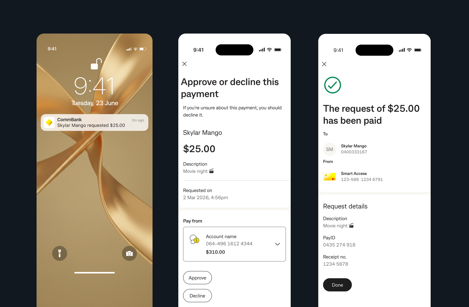
Young Australians were already using apps, messages, and spreadsheets to request and split money. CommBank had no native answer. I worked on a connected social-payments strategy that started with Request Payment, scaled into Split Expenses, and laid the groundwork for contextual AI support inside shared-money flows. The work reframed shared-money behaviour as a banking product problem rather than something users would keep solving outside the bank.
The design opportunity sat beneath the transaction: reduce awkwardness, increase clarity, and make shared-money moments easier to resolve.
Challenge
Shared expenses create emotional friction as much as financial friction. Existing workarounds asked customers to remember who paid, chase manually, interpret payment states, and switch between multiple tools. CommBank's payments experience remained transactional while customer behaviour had already become social.
We split everything but it's messy. I'm always chasing someone for their share or guessing who paid what.
Research
Research surfaced a consistent pattern. Customers did not need more powerful payment mechanics in isolation. They wanted to avoid social discomfort, reduce mental overhead, and stay oriented around who had paid, who had not, and how to follow up without escalating tension.
Fast requests, clear context, easy repayment, and minimal back-and-forth.
Slow follow-up, unclear records, awkward reminders, and disputes about what was owed.
Logged costs immediately, used notes and emojis for context, and stitched multiple apps together to stay organised.
Status language, reminder framing, and cross-bank reach mattered as much as the transfer itself.
Strategy
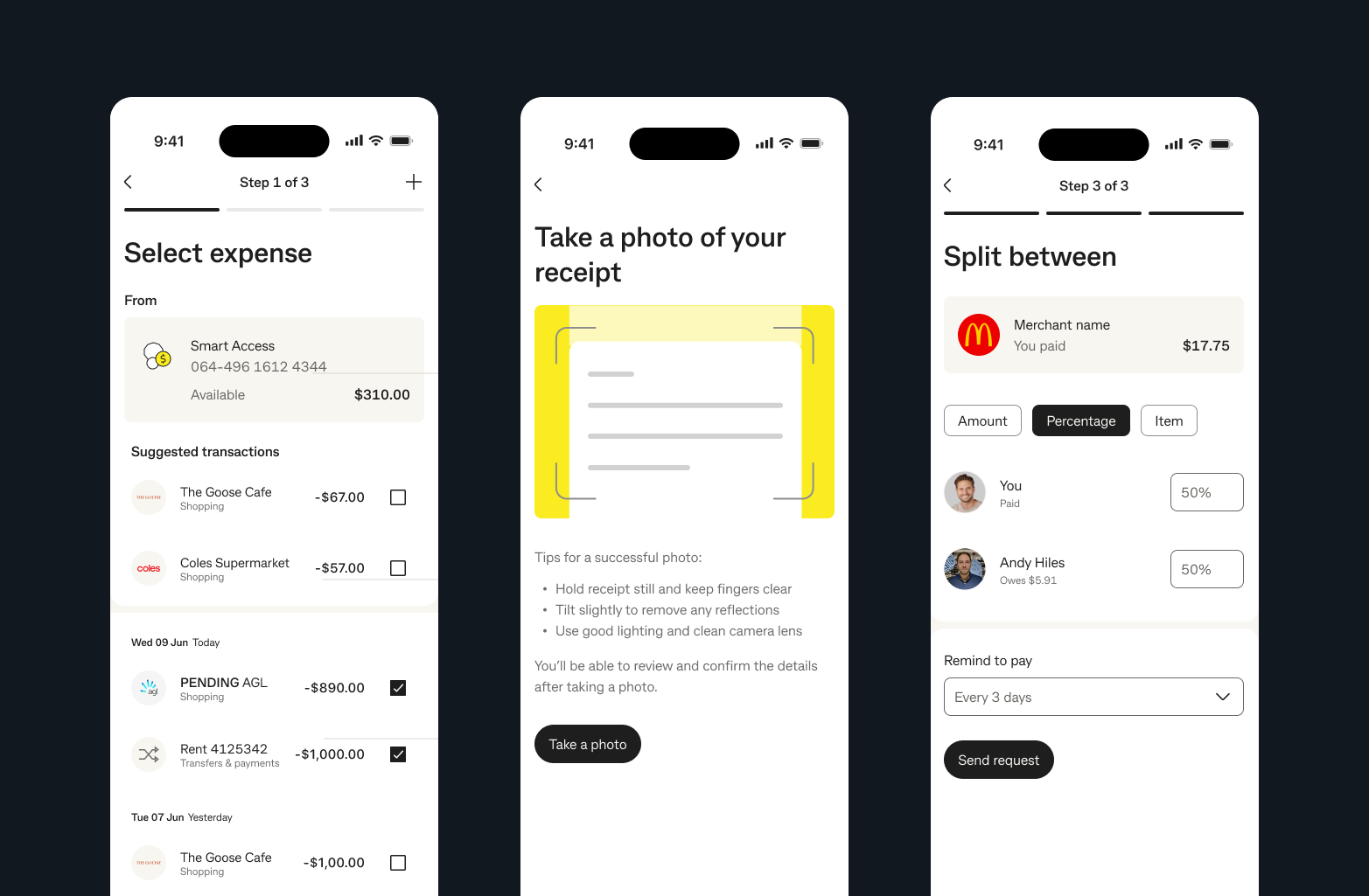
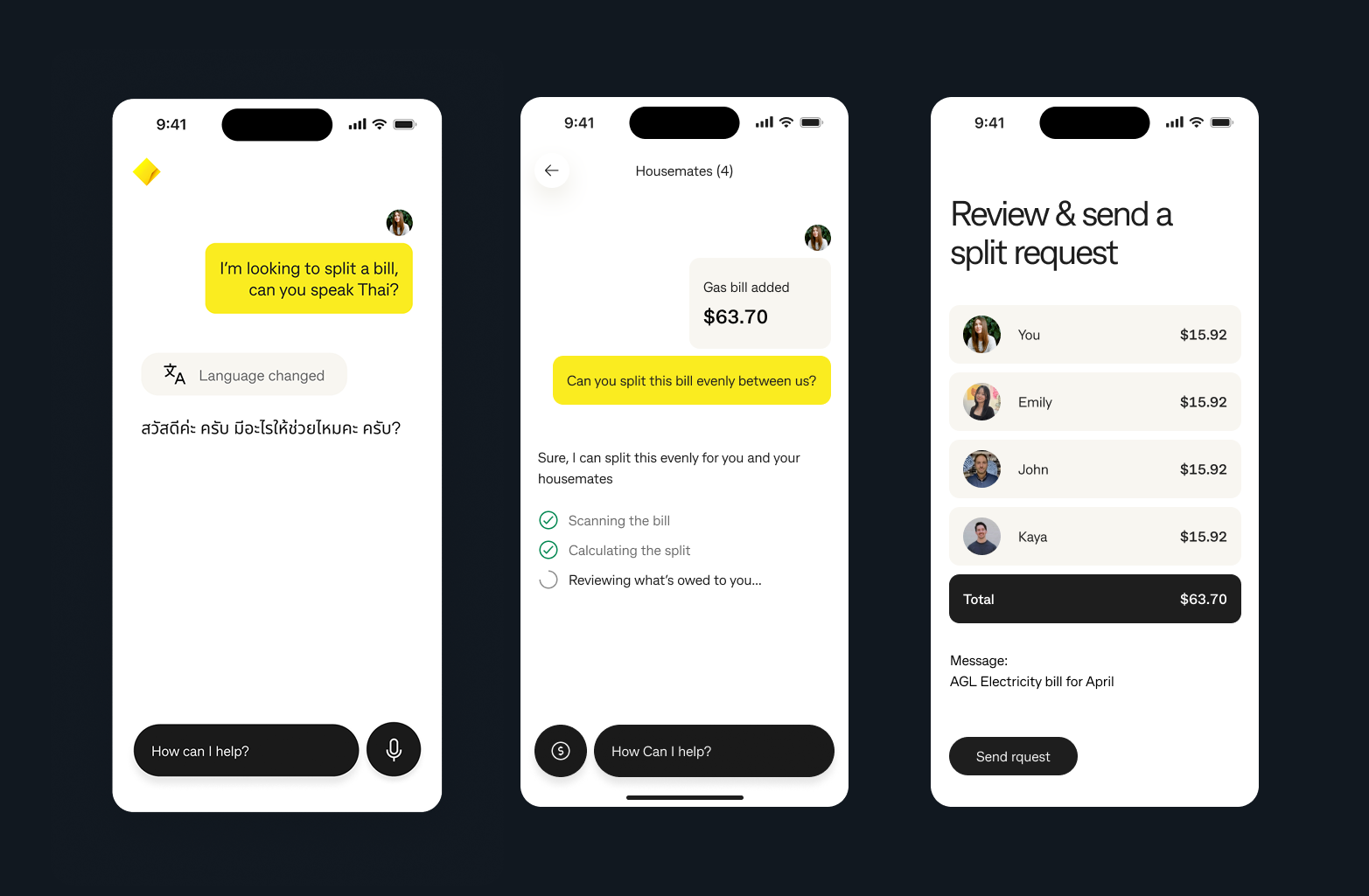
Rather than launching an overbuilt suite, the roadmap sequenced value deliberately. Request Payment solved the sharpest, clearest need first. Split Expenses increased repeat use and shared-money stickiness. Financial Companion integration layered context and guidance on top of the behaviour that had already been proven.
Design
Shared-money flows hide complex edge cases: cross-bank recipients, partially paid splits, reminder tone, viewed-but-unpaid states, and cancellation or clean-up logic once money starts moving. The product needed to feel effortless without reducing people to surveillance or debt-tracking language.
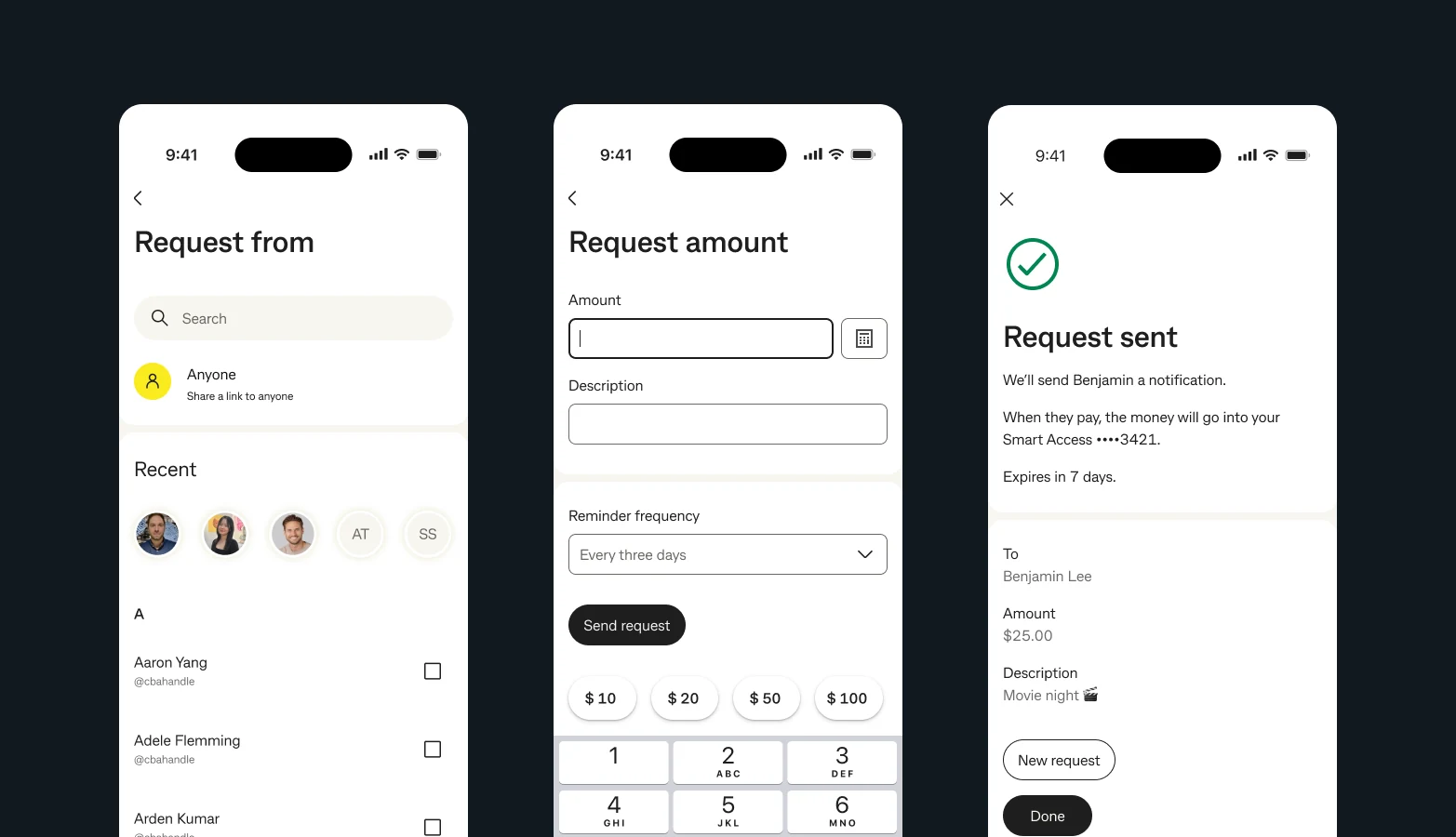

The product detected recipient type silently so the requester did not feel punished by different flows behind the scenes.
Reminders were framed as gentle nudges, not debt-collection events, because the social layer was the real product risk.
We avoided states that felt accusatory. The goal was orientation without turning the product into a source of anxiety.
Split states were designed to stay clear even when the group was only partly settled and follow-up still mattered.
Success
The team tracked success through a mix of behavioural and experiential indicators: whether requests completed without reminders, whether shared-money use became more frequent, and whether customers chose the bank experience over fragmented third-party workflows.
Reflection
The mechanics of moving money were already largely solved. What had not been designed well enough was the social choreography around the money: context, reminders, visibility, and tone. That is what determined whether the feature felt helpful or stressful.
This program also sharpened how I think about compounding product systems. Social payment patterns, cross-bank handling, and status language fed back into other payments work and helped me see how adjacent product domains can strengthen one another when the design practice stays connected.
Back to the start
Return to the homepage to move between the strongest fintech work, leadership context, and the broader point of view behind the portfolio.
Back to homepage